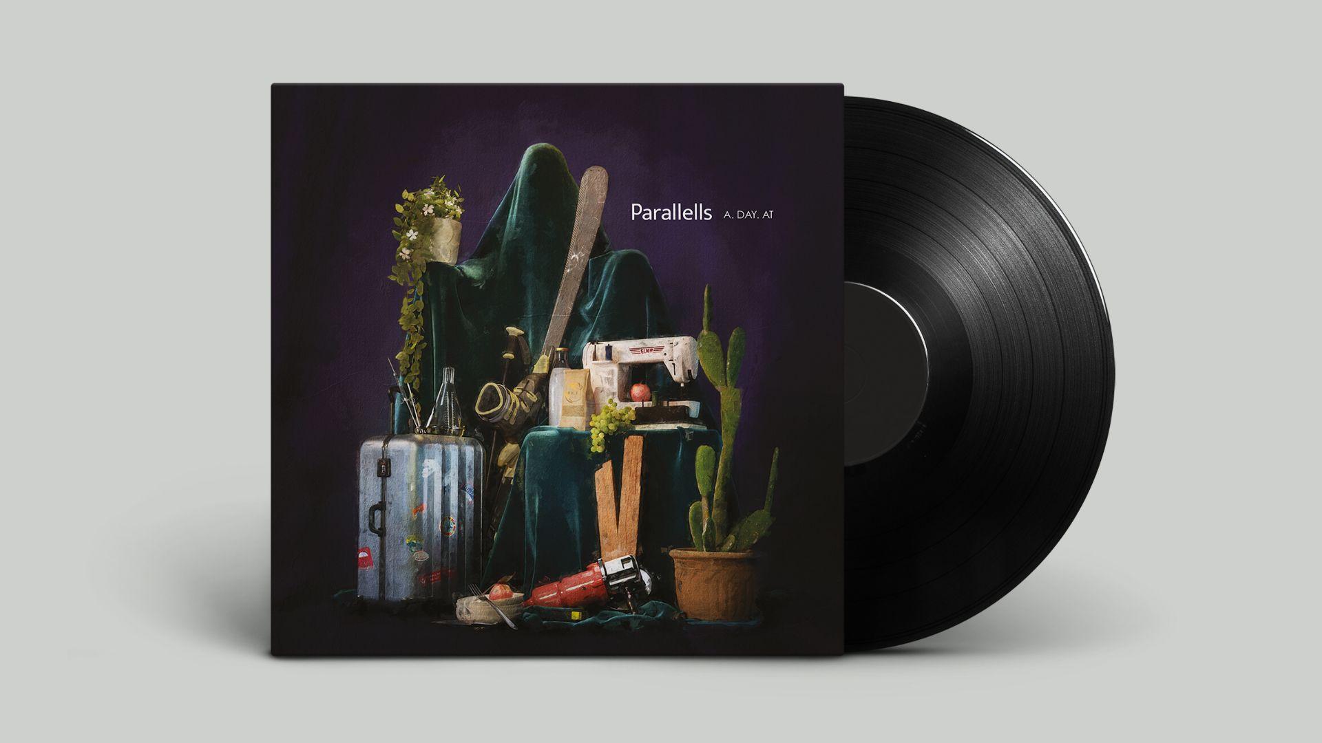
SMOKEY EYES

Smokey Eyes — Poster Recap
Like a late-night indie album cover dipped in heartbreak and smeared eyeliner, the Smokey Eyes poster doesn’t just show a character it reflects her collapse. Hand-drawn type bleeds like mascara mid-breakdown, split across a mirror that tells no truth, only distortion.
No big drama. No fake glamour. Just raw emotion, cracked reflections, and that red glow of something falling apart beautifully.
GOOD PEOPLE — Production ID Breakdown
From blur to bang, like memory kicking in.
The brief was simple: introduce Good People like they just walked into a theater mid-scene stylish, confident, Timeless, but with bite.
We built a logo reveal that’s not just an intro, it’s an atmosphere. It starts in the dark — a soft blur, like the inside of an eye before it adjusts to light. You hear it first: the subtle hum of cinema ambience, that nostalgic film roll flutter, the low hiss of something about to click into focus. And then clarity.
The GOOD PEOPLE mark snaps into sharpness, bold and unbothered. From distorted inkblot to full-bodied red type, the transition mirrors what the company does best: turning vision into precision. Chaos into narrative. Grain into frame.
The sound design doesn’t just support — it anchors. The reel spin. The distant projector flicker. It’s not decoration, it’s DNA. You’re in the theater now, whether you meant to be or not.
This isn’t just a production house ident. It’s a quiet mic drop.
GOOD PEOPLE: they don’t shout. They roll film.